Fifteen pages from a blank canvas
RocketNode runs game servers. FiveM, the multiplayer platform for GTA V, is the product that matters most, with Minecraft, Rust, Palworld and a long tail of other games behind it, plus VPS, web hosting, Discord bots and dedicated servers.
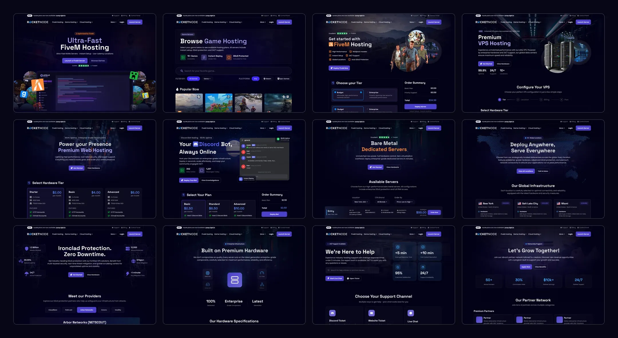
I designed the site page by page from nothing: homepage, game browser, a page for every game, four cloud products, then locations, DDoS protection, hardware, partners, support, affiliates, about and legal. Fifteen page types in all.
Four decisions did most of the steering:
- A hero with real character, built around RocketNode’s own product. No carousel.
- Plans in cards, every option visible at once. No slider.
- Buying a server as a short set of steps: hardware tier, location, billing cycle, extras such as storage or priority support.
- VPS on the same system, without feeling like a game page with the word “VPS” swapped in.
Six versions of one hero
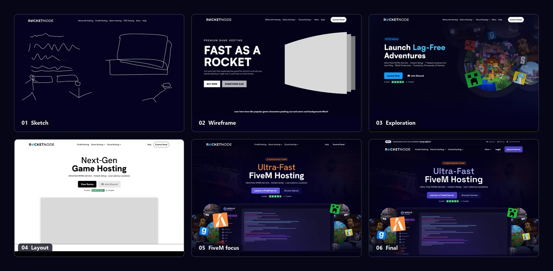
The hero took more rounds than any other part of the site.
The first wireframe was a headline on the left, “Fast as a Rocket”, with a grey box on the right and a note to myself underneath: popular game characters peeking out, some cool background effect. Version three was that note taken literally. A cluster of game worlds floating beside the headline, bright and busy. It worked as an image and said nothing about RocketNode. Any host could have shipped it.
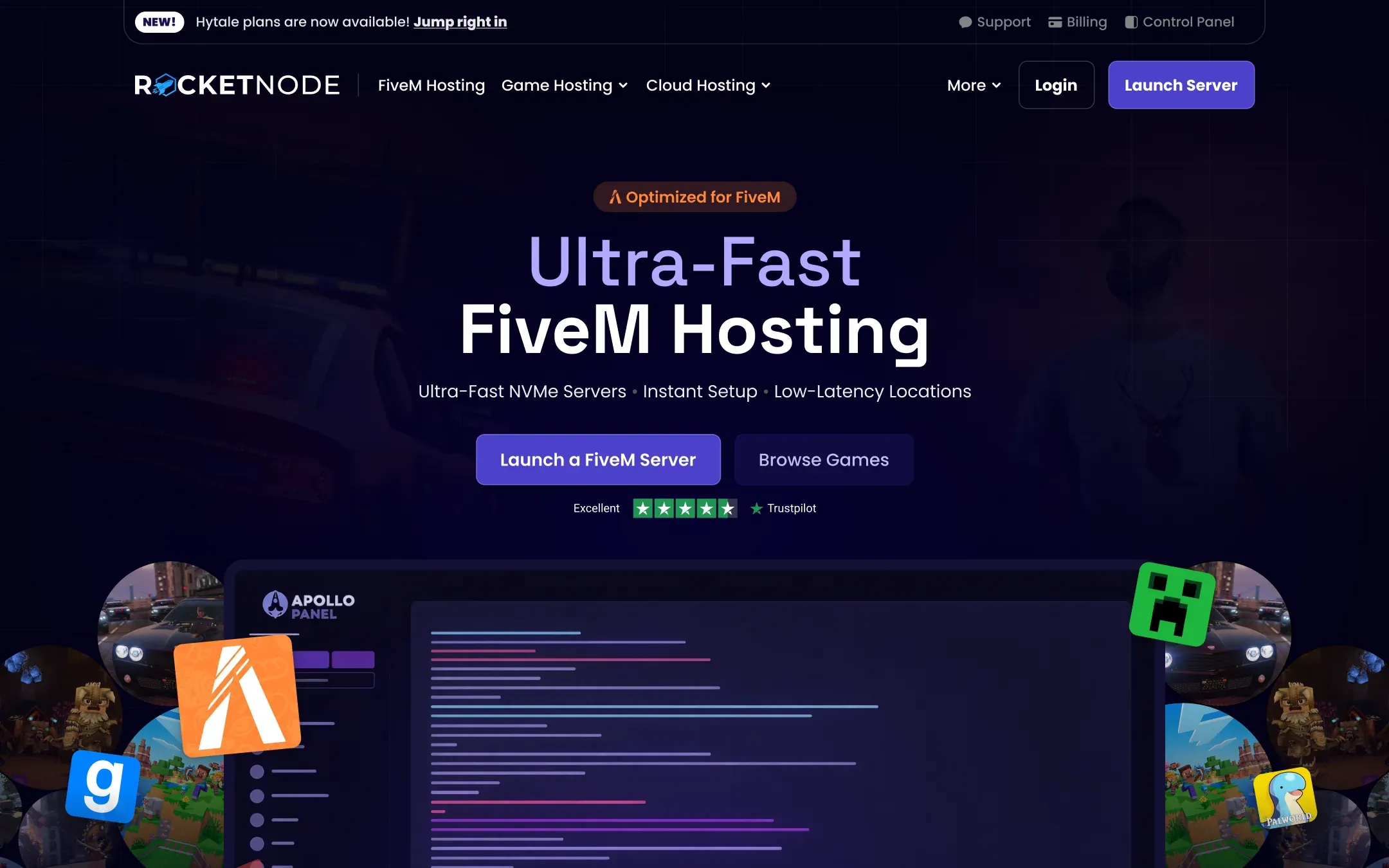
So I threw the colour away. Version four is a grayscale, centred layout with one grey rectangle where the picture would go, and that constraint turned out to be the useful one. The rectangle had to earn its place, and the thing that earned it was the product: the Apollo game panel, the screen customers will actually live in, with the games it runs arranged around it. You can read what the company does from the picture alone.
Two late changes finished it. The headline moved from a generic “Next-Gen Game Hosting” to “Ultra-Fast FiveM Hosting”, because FiveM is the product the whole site is built around. And the accent moved from orange to the purple used across the rest of the site. The orange belongs to FiveM, and in the final version it survives in exactly one place: the “Optimized for FiveM” badge above the headline.
A menu for dozens of games
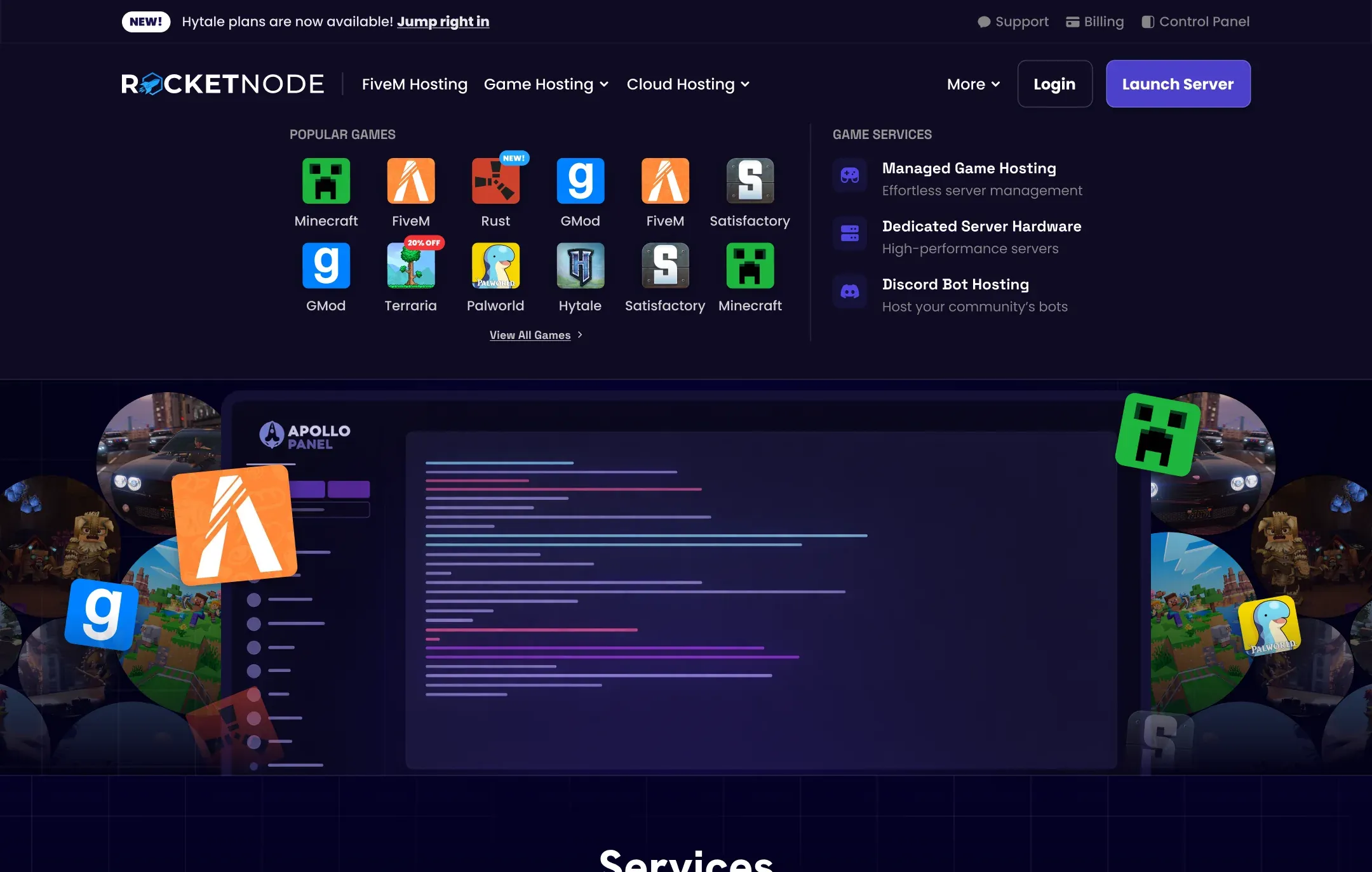
Dozens of games and five hosting products is too much for a flat navigation bar, so the header has two layers. A slim top bar carries the announcement of the moment (Hytale plans, when these screens were made) and the account links: support, billing, control panel. Below it, FiveM Hosting gets its own top-level link rather than a place inside a dropdown, which is the navigation making the same point as the hero.
The Game Hosting menu is an icon grid. People who host Rust know the Rust icon, so the grid leads with the artwork and keeps labels small. Little badges handle what is new or discounted without a separate deals page, and a second column lists the game services that are not tied to one title: managed hosting, dedicated hardware, Discord bots.
Steps instead of a slider
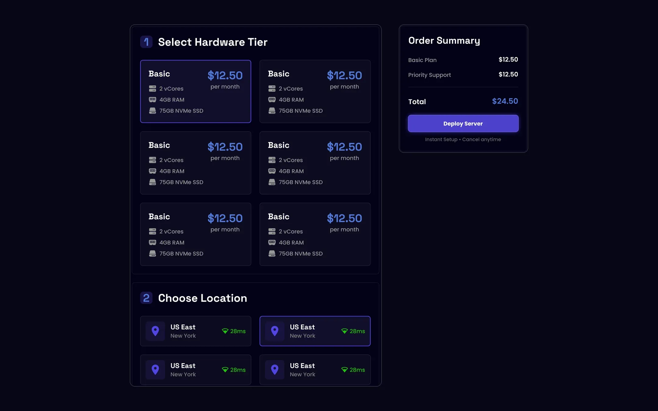
Most hosts sell plans with a RAM slider. Drag it, watch a price change, hope the hardware behind it is good. I went the other way: the game pages got a numbered configurator instead.
Step one lays out every hardware tier as its own card with the specs that matter for a game server: cores, memory, NVMe storage. Step two is a grid of locations, each with an estimated ping from where the visitor is sitting. An order summary sits to the right the whole time, listing the plan, any add-ons like priority support, and a running total, with “Instant setup, cancel anytime” under the deploy button. Nothing about the price waits until checkout.
VPS: fewer choices, one at a time
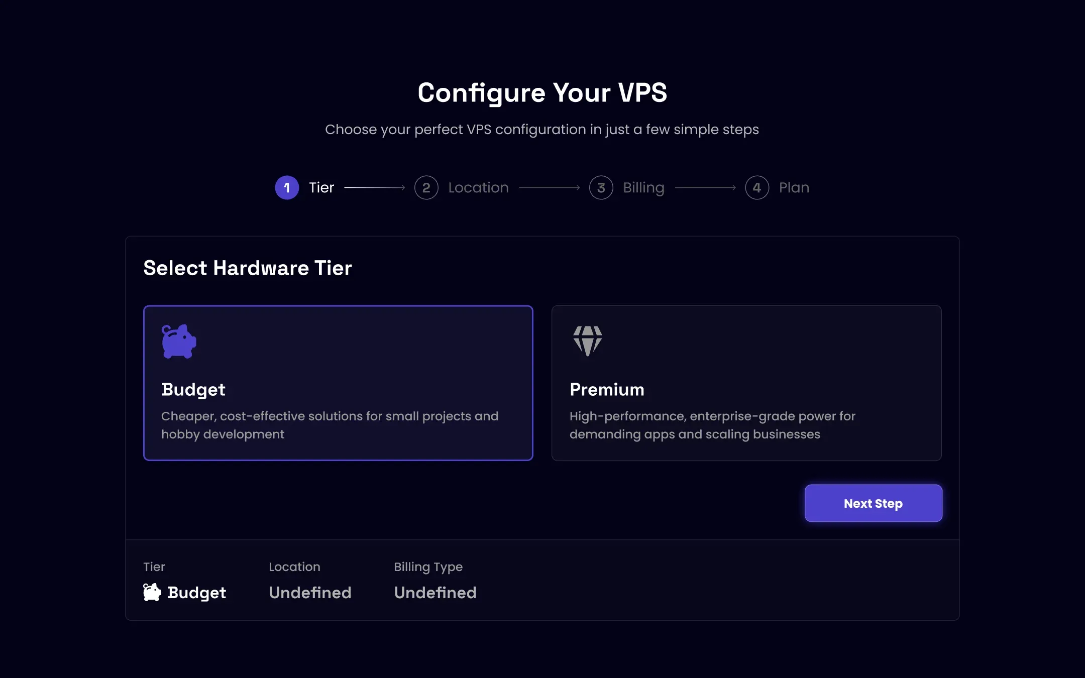
A VPS buyer makes a different kind of decision. There are two tiers, Budget and Premium, and the choice between them changes everything that follows. Showing every step at once would mean showing plans the customer can’t buy yet.
So the VPS configurator reveals itself step by step. A four-stage progress bar across the top (tier, location, billing, plan), one decision per screen, and a summary strip along the bottom that fills in as choices are made. The cards, the numbered steps and the purple selection state are the same components as the game pages. Only the pacing changed.
One kit of sections
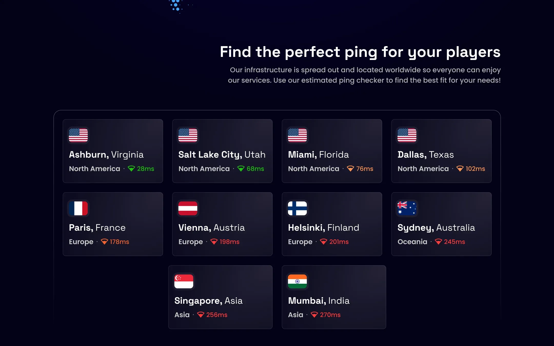
Fifteen page types stay consistent only if they are built from the same parts. The site is one set of sections reused everywhere: features, data centre locations, the game panel, DDoS protection, FAQs, reviews, blog posts and a closing call to action. A product page adds the thing only it needs, such as its plans or its partner tiers, and the kit does the rest.
The location grid is the piece I would point to first. Ten cities across four continents, each with its region and an estimated ping, coloured from green through orange to red. You don’t need to read the numbers to see that Ashburn is close and Mumbai is not, which is the whole job of that section.
Mobile
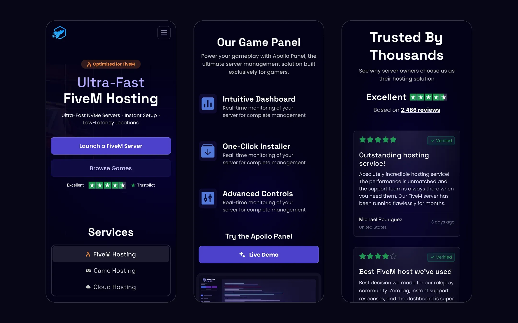
Every section in the kit has a phone version, designed rather than left to collapse on its own. The hero stacks and keeps its two buttons and Trustpilot line. The services selector becomes a short list. The game panel section, a diagram on desktop, becomes three features with icons and a “Live Demo” button, with the panel itself peeking in at the bottom. Reviews turn into a column of cards under the overall rating.
What shipped
The full site is live at rocketnode.com.